Samsung
SEM Dashboard
"I look at this report every day — but I still can't find anything at a glance."
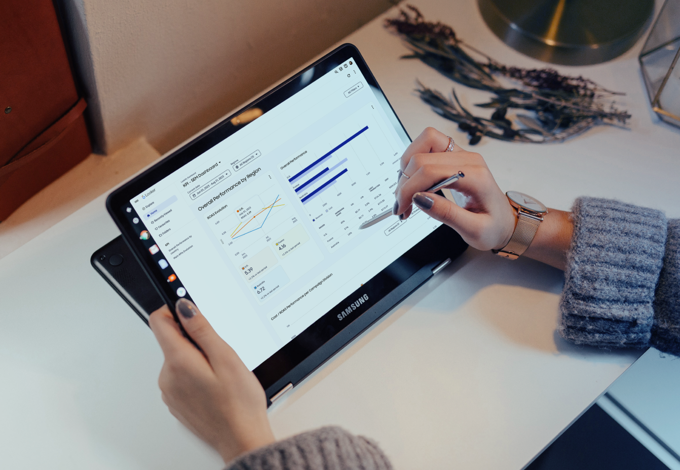
Samsung's global marketing team used the SEM dashboard daily across 3 countries and 7 tabs.
I restructured the IA and data hierarchy to make key performance signals visible upfront.
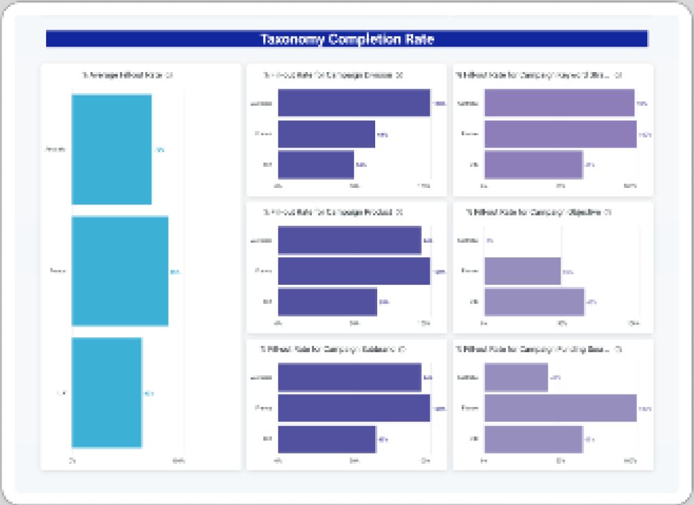
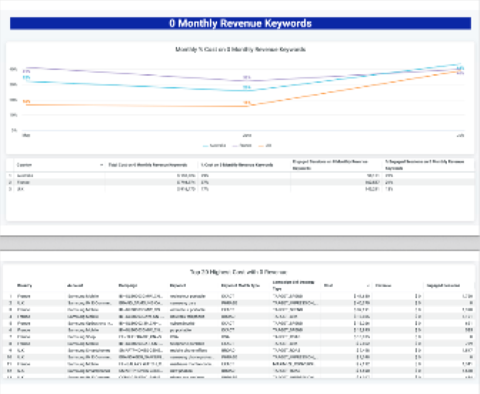
⚠ Some screens blurred per NDA
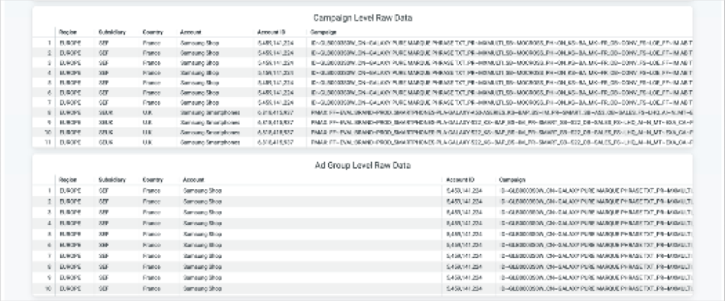
Repeat users shouldn't need to search.
They did — every single time.
HIGH
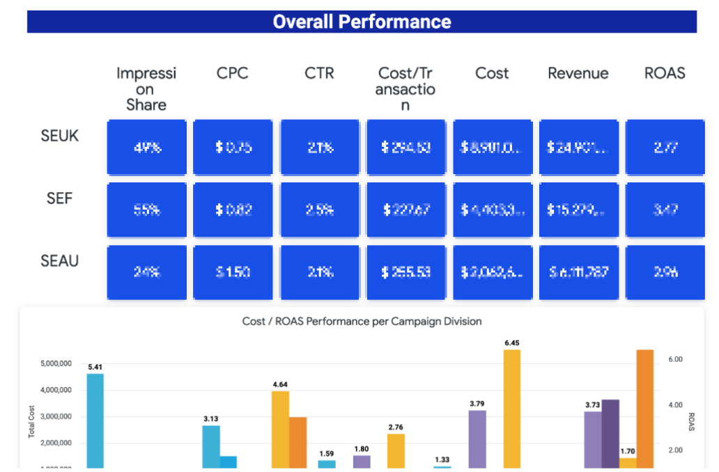
Information overload
Core metrics competed with secondary data.
HIGH
Color without meaning
Color was used as styling, not information.
HIGH
Missing
labels
labels
Missing labels made charts harder to scan.
HIGH
No
visual hierarchy
visual hierarchy
The screen gave no clear reading order.
Research
Method
User interviews + 4 proto-personas
Mapped how senior directors, HQ teams, country marketers, and analysts scanned performance differently.
Benchmark
Best-in-class analysis
Compared best-in-class dashboards and Looker Studio patterns to identify recurring gaps in hierarchy, comparability, and context.
Three design principles emerged from research — each addresses a distinct failure.
01
Hierarchy — Critical data visible without navigation
→ Solution ① Hierarchy
02
Comparability — Same data, multiple countries, one screen
→ Solution ② Comparability
03
Connectivity — Raw data to action without leaving the dashboard
→ Solution ③ Connectivity
Solution
From a sea of blue blocks to a readable dashboard
AS-IS
TO-BE
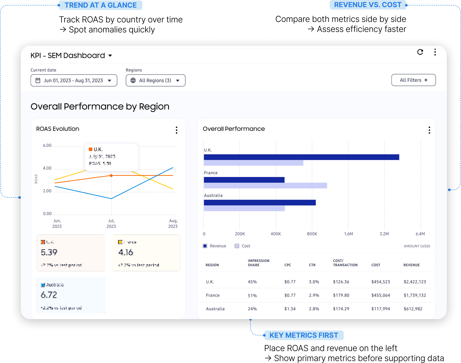
Blue blocks removed — typography carries the hierarchy
AS-IS
TO-BE
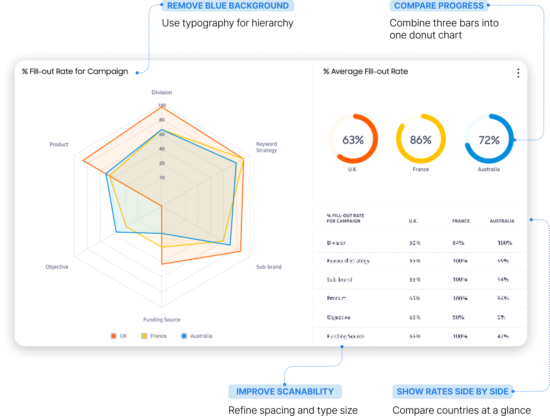
6 separate charts collapsed into one comparable view
AS-IS
TO-BE
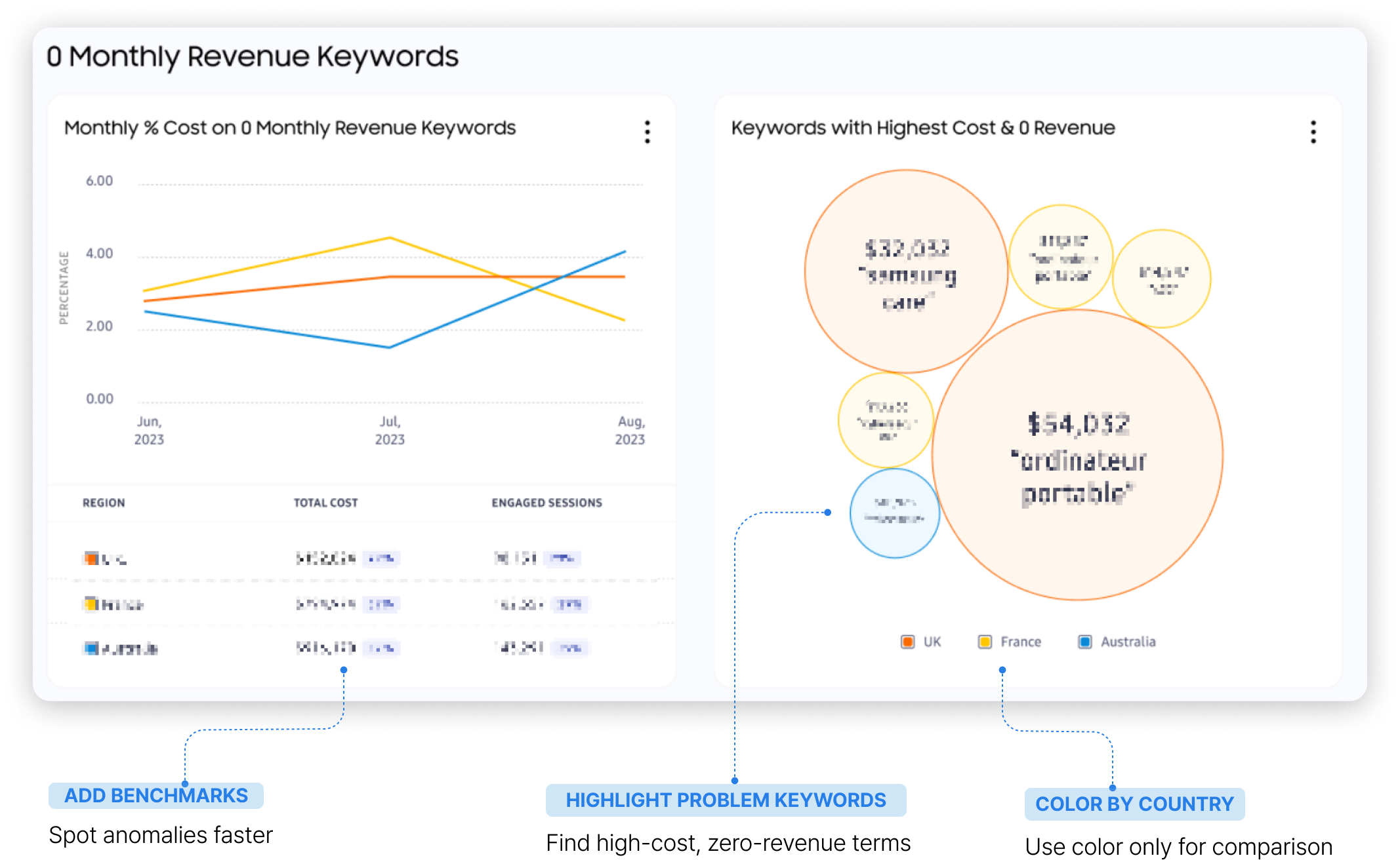
From 40-column manual scan to one-click export
AS-IS
TO-BE
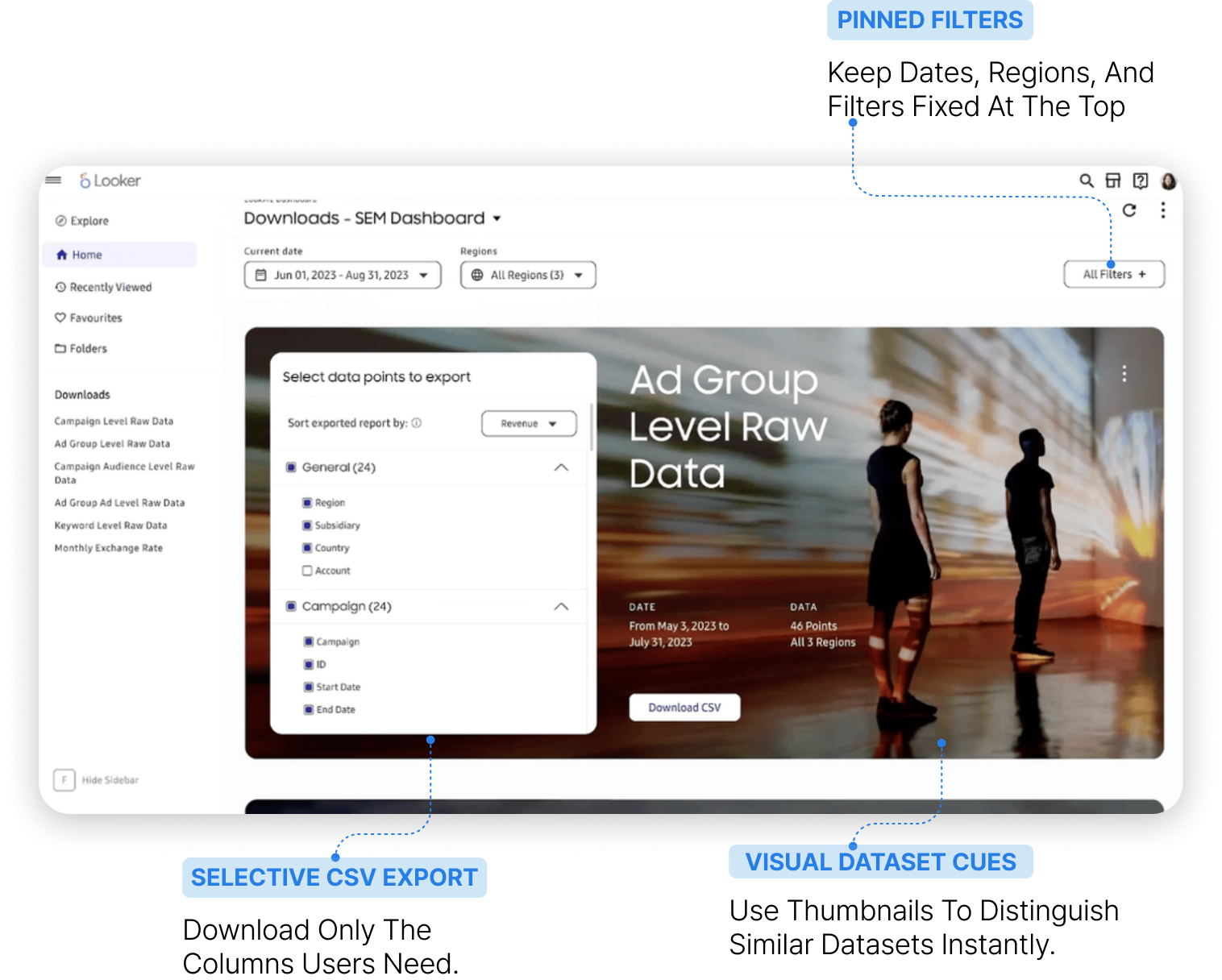
Live prototype
Designed in Figma, deployed in Google Looker
Impact
91%
User satisfaction
— internal survey post-redesign
— internal survey post-redesign
40%
Reduction in navigation time
3
Countries unified into
one user-centered IA
one user-centered IA