Communication UX
Mobile Friendly
2025

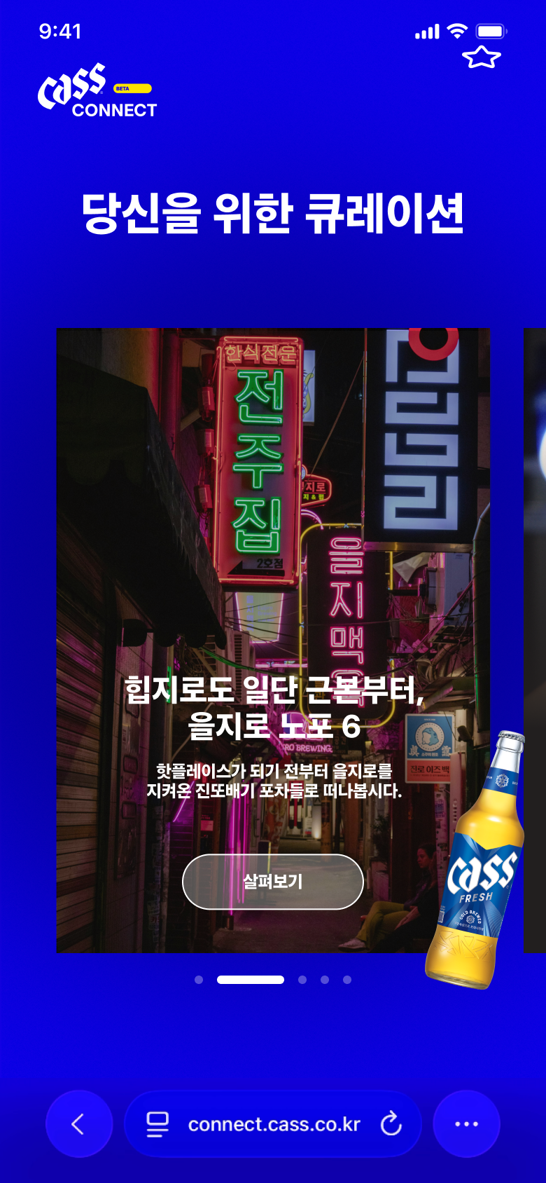
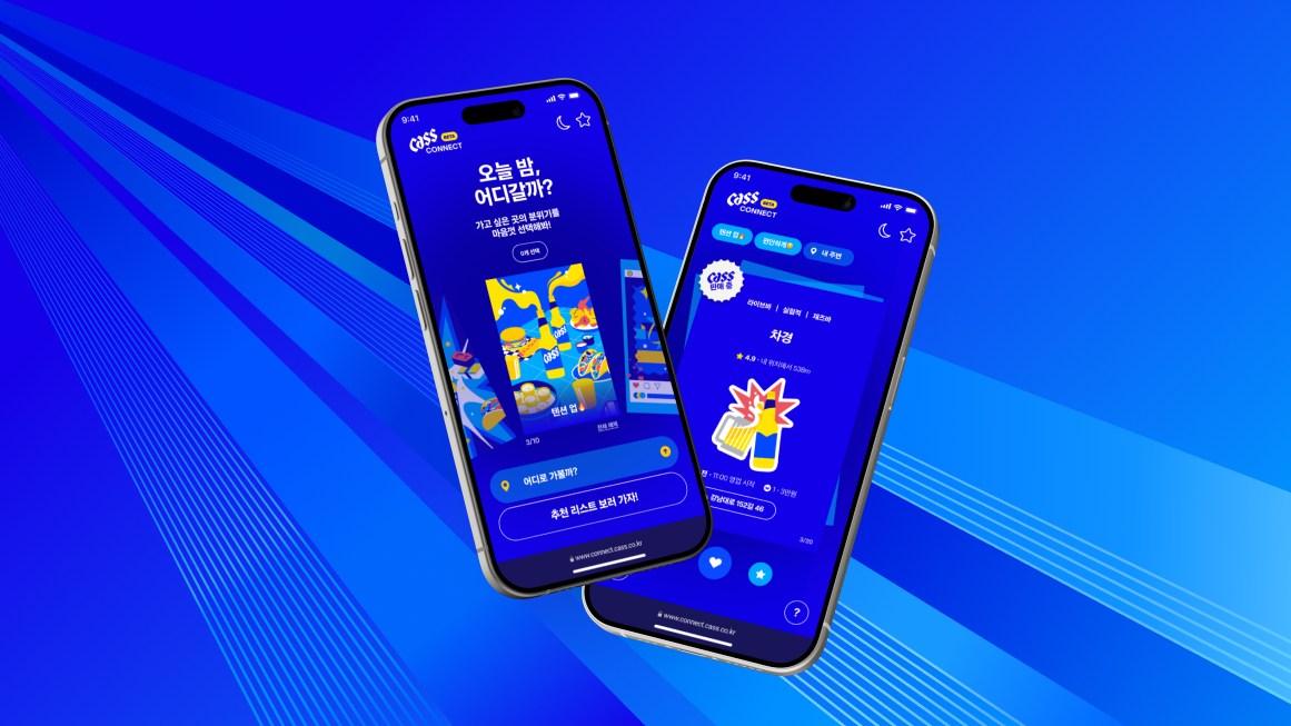
Cass Connect

96–98% of ad-driven users left on the first screen.

Using GA4 funnel data and session replay,

I identified where users dropped off and redesigned the flow around mood and context.
Client
Cass
Role
UX Lead  — Strategy, IA, Wireframe, Prototype
Year
2025
Platform
Responsive Web

Background

"People don't search for a bar — they search for a vibe."

Brief
Cass needed a venue discovery platform that could turn ad traffic into retained users.
Problem
Existing apps filtered by location or rating but users chose venues by mood, occasion, and social context.
Opportunity
Design a mood-first flow that feels like a friend’s recommendation not a search engine.

GWI · KEYWORDS · SOCIAL LISTENING → PERSONA

We didn't guess who the user was.
We found them in the data.

Sentiment

83%

Positive — Strong brand affinity, with negative spikes around health and excess drinking.

What they talk about

24%

Location mention — Location was a recurring topic and a clear UX entry point.

Where they are

70%

Instagram Discovery — Instagram was the primary venue discovery channel for this cohort.

Primary Persona

New Drinker

A digitally connected socializer exploring new tastes and expressing personal style.

3.02M

projected pop · Age 20–34

Pain Points → Design Triggers

No vibe/ambience filter — Users could search by category or proximity but not by mood.
Weak Atmosphere Cues - Photos did not communicate the venue vibe quickly.
No social shortlist — Users could not save and share a curated night-out list.

Design Direction

Mood-first. Context-aware.
Cass-curated.

Emotion
Before Location
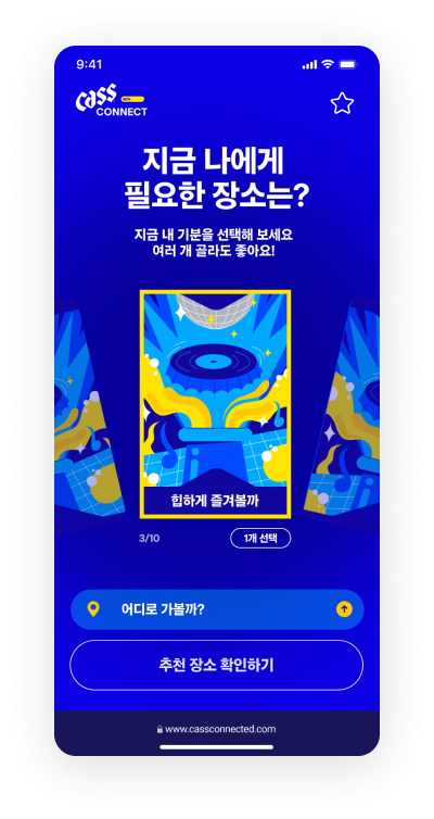
Start with mood, not search.
Vibe in
One Second
Use full-bleed photos and minimal text to make atmosphere instantly readable.
Brand
Without the Ad
Show Cass venues as contextual recommendations, not banners.

Wireframe — Key Screens

From IA to interaction, before any hi-fi

Four core screens were tested before visual design to validate flow clarity, momentum, and the retention loop.
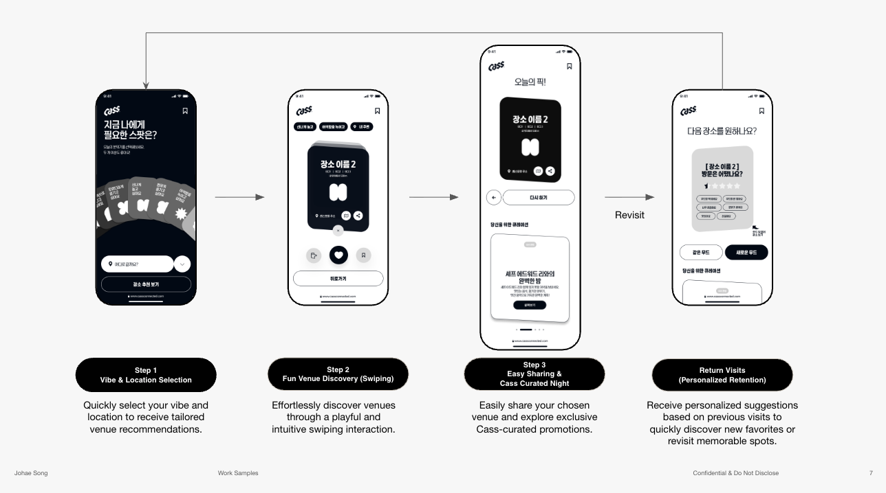
Cass Connect wireframe flow

"Where to drink?" was not the question
— "what mood am I in?" was.

01
Research
Keyword analysis and social listening mapped real consumer needs.
02
Benchmark
Naver, Kakao, and Catchtable audits showed where context was missing.
03
Design
A Mood → Browse → Save flow was validated through user testing.
User flow
01
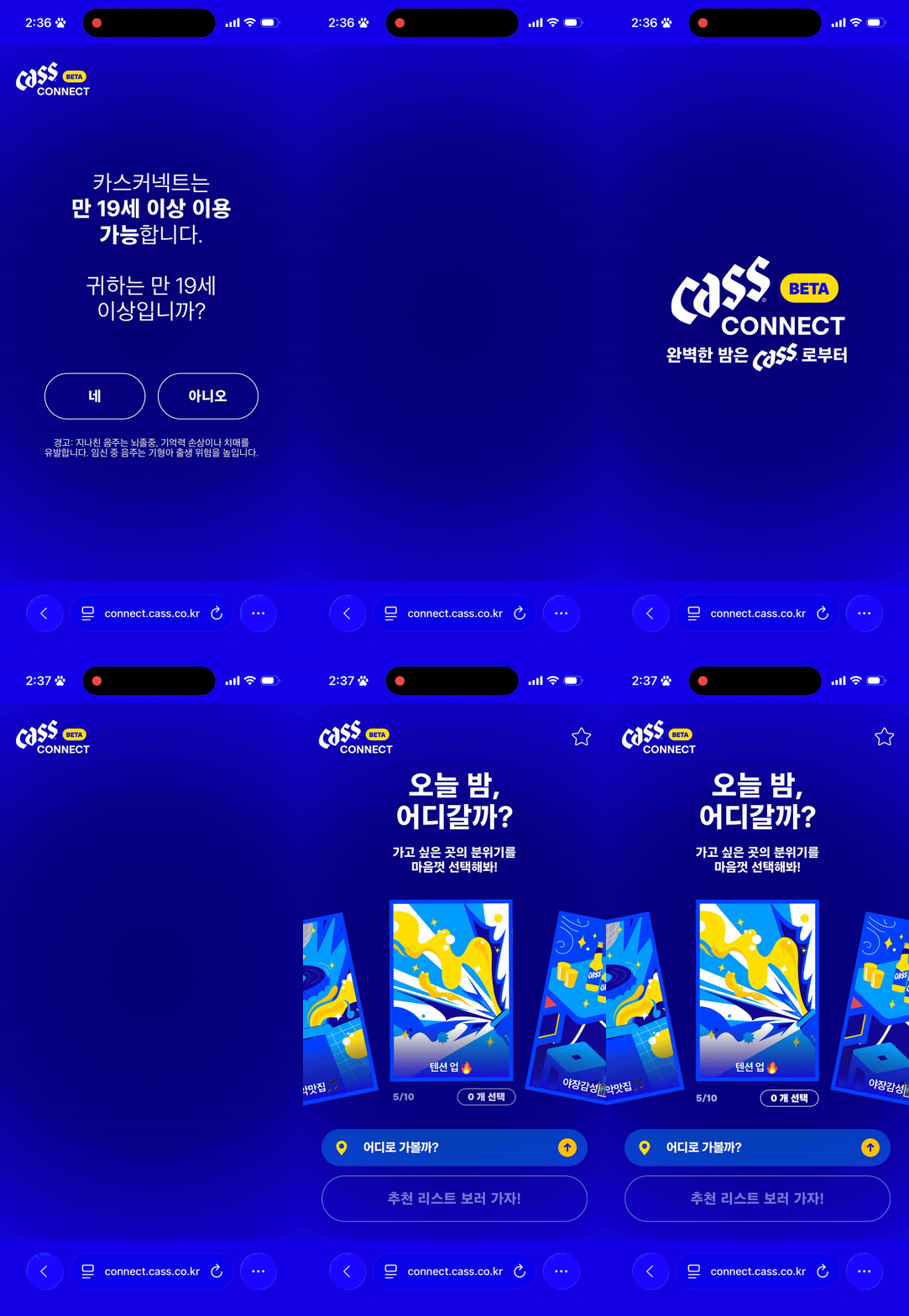
Landing
- Instant Mood Rollout
Start with age check, then reveal a mood card to set the tone
02
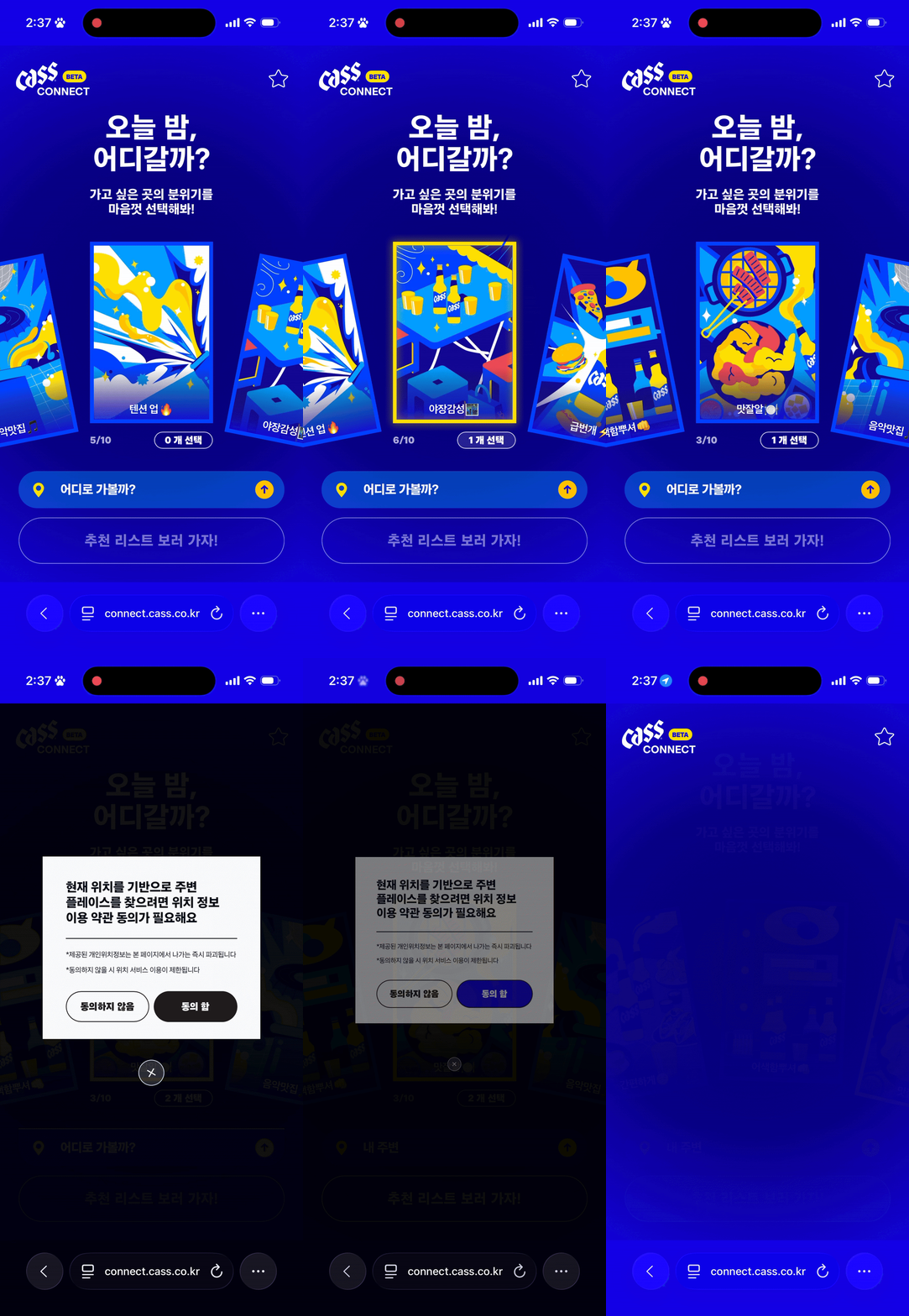
Personalized Discovery
– Set Your Vibe
Choose a vibe and location to get matched venue suggestions.
03
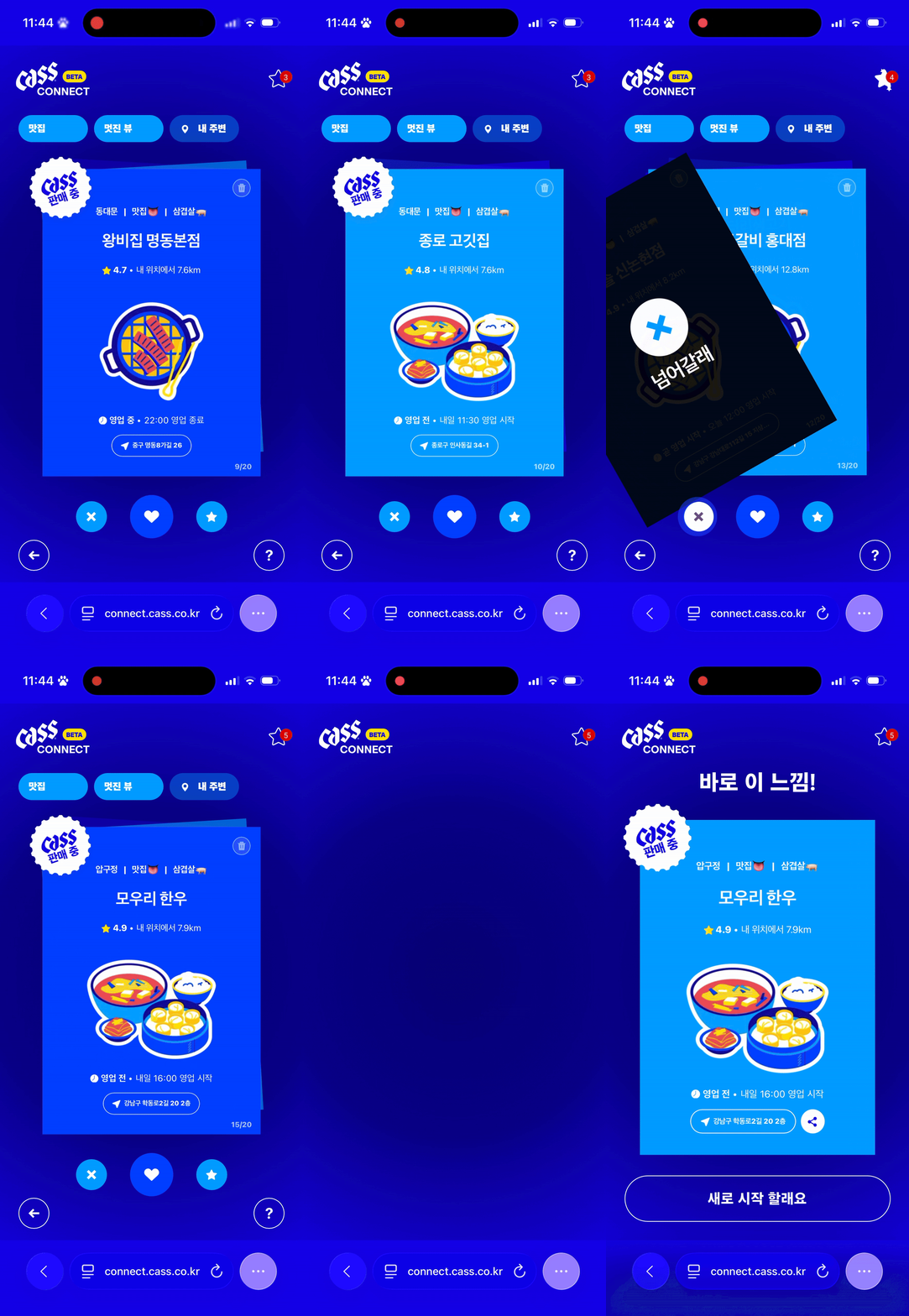
Engaging Exploration
– Swipe, Discover, Decide
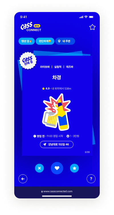
Swipe through venues and decide quickly
04
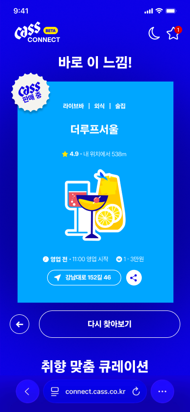
Easy Social Planning
– Share the Moment
Share the selected venue with friends to coordinate the night out.
05
Brand Connection
Cass-Curated, Not Ad-Driven
Cass-curated spaces appear as contextual recommendations.
Step screen

Users left before they understood the service.

GA4 funnel data and session replay revealed three drop-off points each pointing to a different design failure

96–98%
First-screen exit rate


Ad-driven users left before interacting
① Clarity & Guidance
Hero copy + 1–2 step onboarding needed to set expectations
44.06%
Steps 2→3 conversion


Users picked a mood, then lost momentum.
② Engagement & Motivation
Post-action feedback, reward signals, and loading animation
0.26%
Step 5 reach rate


A major drop-off revealed a trust and relevance gap
③ Depth & Trust
Real photos + AI summary + brand sponsor info on place cards
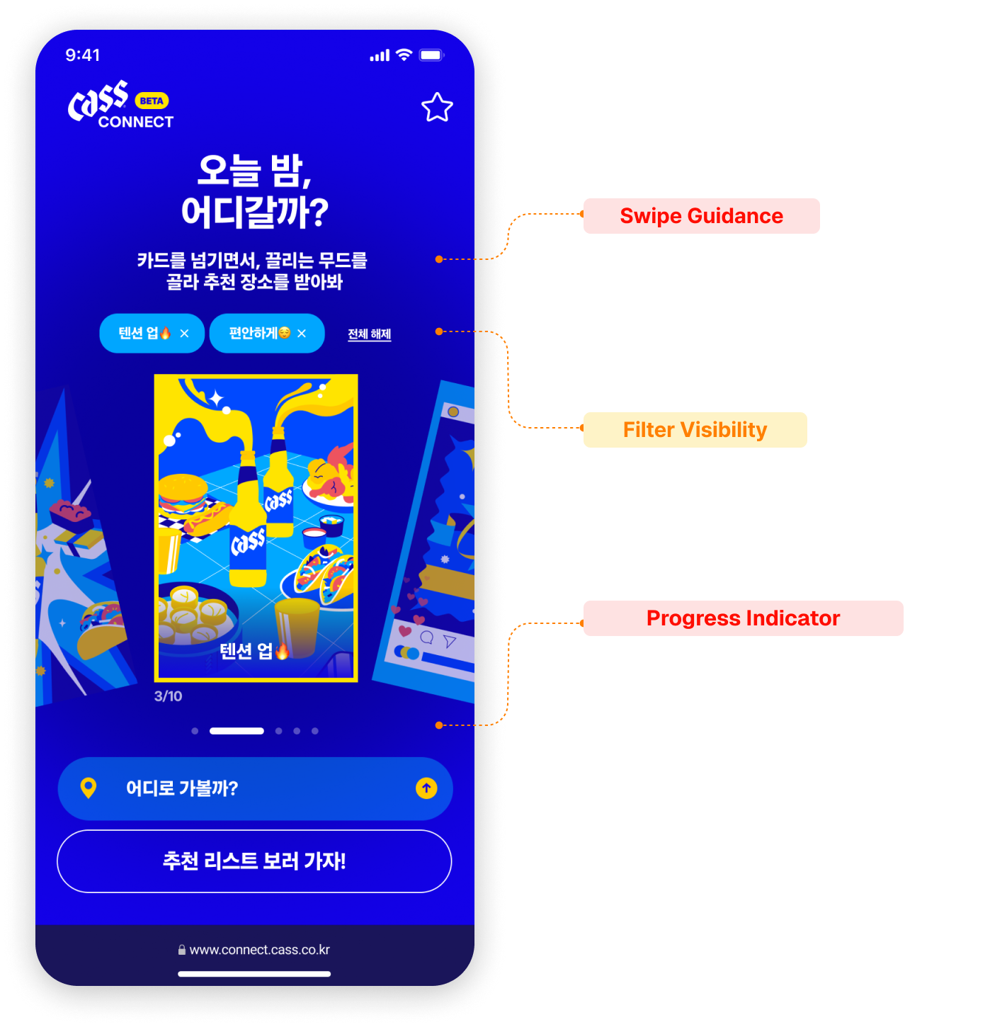
Solution 01 — Home screen
Make the First Action Obvious
Swipe became the entry point

when users missed how to start.
AS-IS — Home screen
No swipe signal, no state feedback

User flow: No signal → hesitation → drop-off
HIGH — Order Bias Top 3 drove 47.3% of choices
HIGH — Weak progress motivation Progress lacked completion push
MID — Hidden State Selected moods were unclear
TO-BE — redesigned
Swipe action copy + dot indicator + chip state
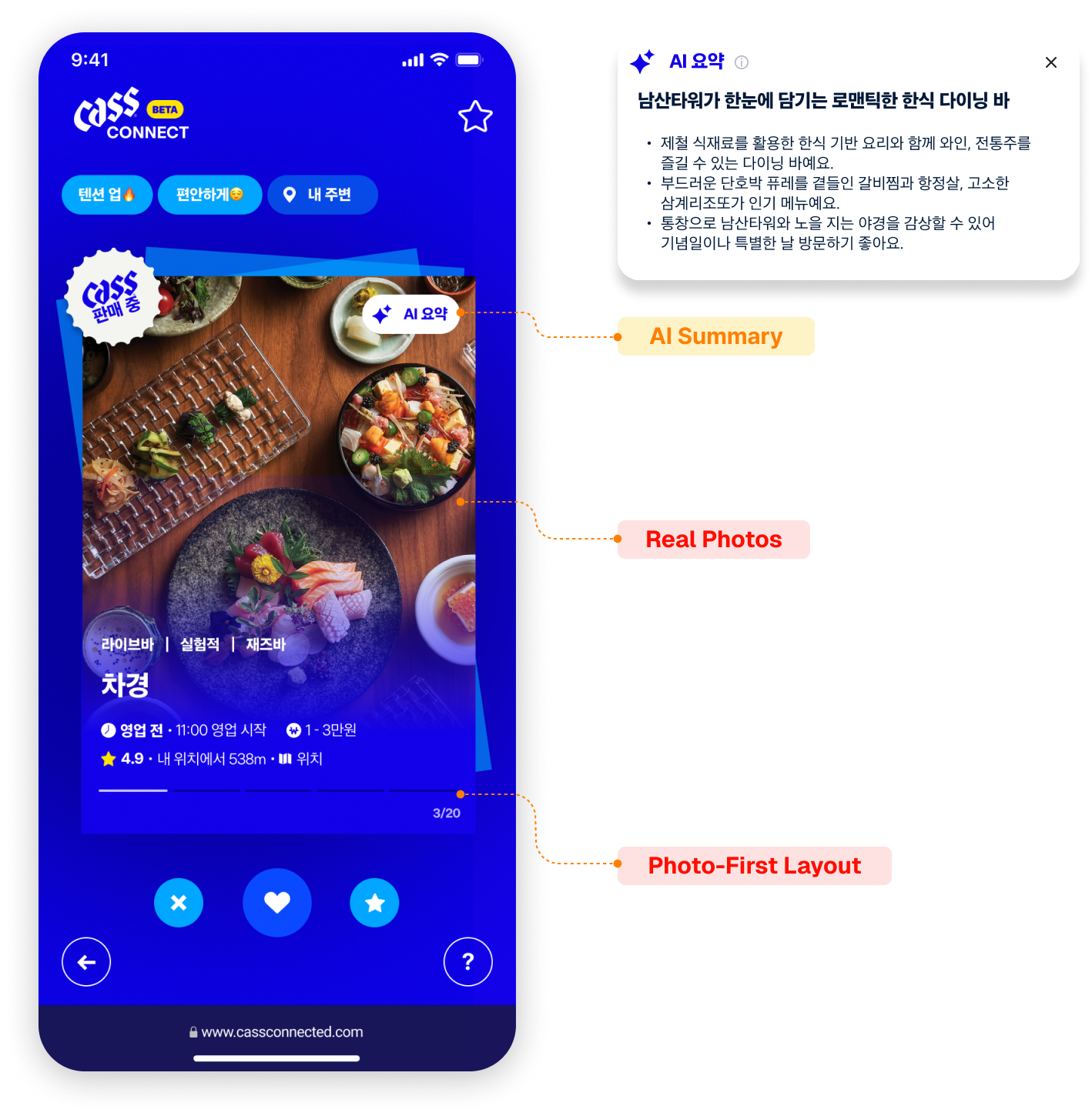
Solution 02 — Place card
Add Context Before Decision
Real photos and quick summaries

helped users decide faster
AS-IS — Place card selection
Illustration only — can't judge atmosphere

User flow: Illustration → Uncertainty → External search → Exit

HIGH — Low Trust Illustrations made the real vibe unclear
HIGH — No Feedback Actions gave no clear response
MID — Weak Context Missing summaries increased effort
TO-BE — redesigned
Real photos + AI summary chip + loading animation

User decision flow: Real photo check → AI summary → instant action → visit decision
More Work View all →
;box-shadow:0 -2px 12px rgba(0,0,0,0.15)"> This site is desktop optimized — for the best experience, view on a desktop or tablet.